
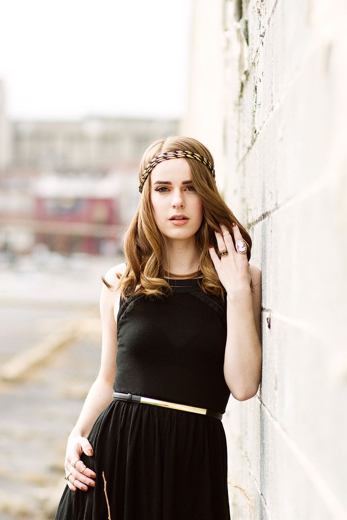
Here’s the final installment of my series on how to style leggings with bold prints! And I’m wrapping up the series with another set of art print leggings, this time from another great artist, Alphonse Mucha. I’ve always loved his Grecian/Romanesque style portraitures of women.
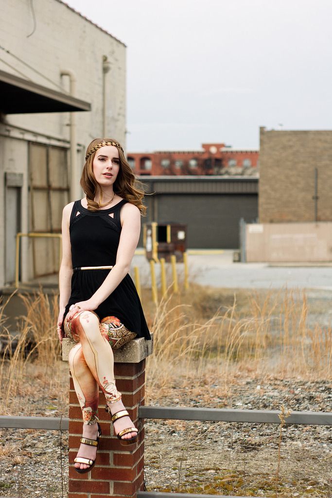
Look one: Anora Crescent Photography
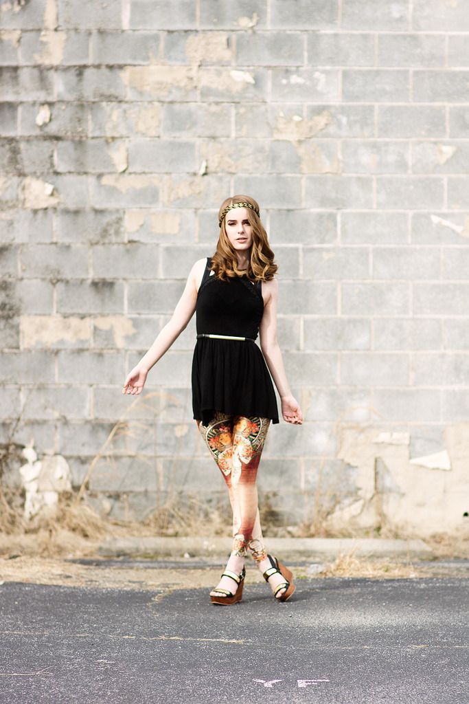

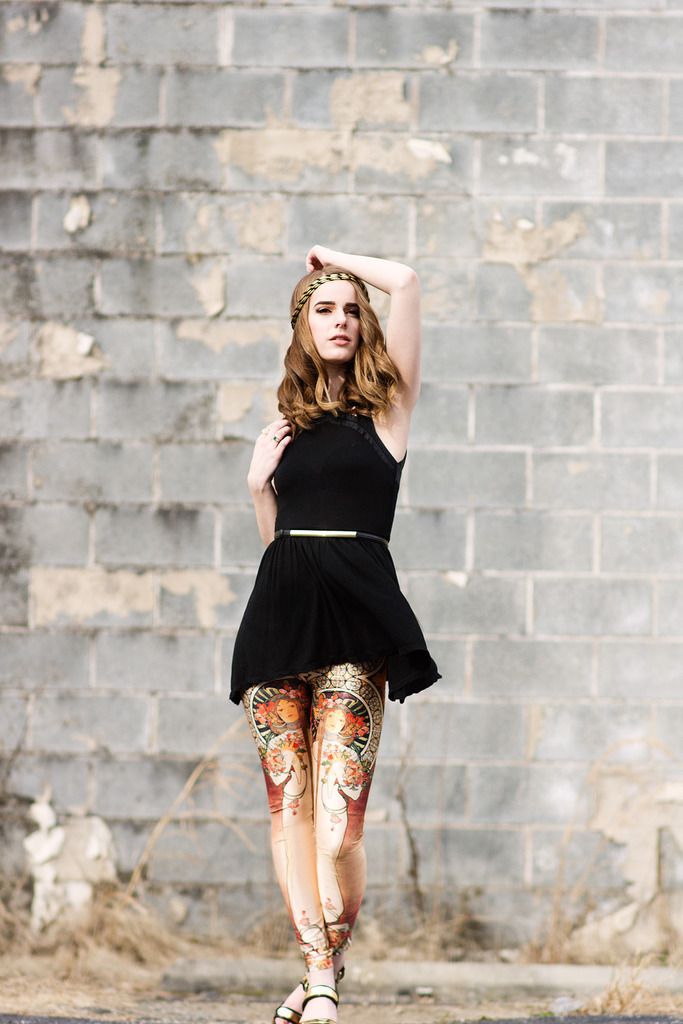
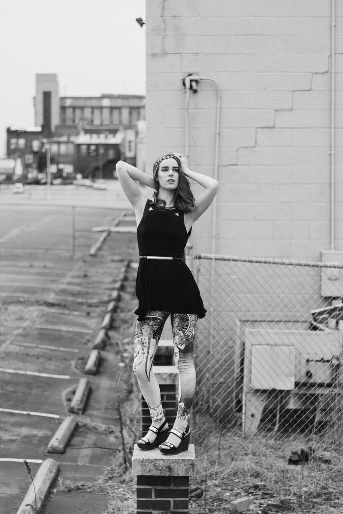
For the first look, I used a black mini-dress that was
perfect for the leggings – the hemline ended right above the beginning of the
print. I really can’t wear this dress with much else because of the length, so
it’s great for pairing with leggings. Again, I chose this dress for its solid black color,
but it also had a unique design around the collar, so it felt more than just a
plain black dress. For the whole ensemble I went with all gold accents,
especially in the accessories. The necklace, belt, and shoes all shared the
theme of solid gold bars. I love being able to connect items in this way!
This was my first time working with photographer Cyndi of Anora Crescent Photography and she did such an amazing job capturing both the boldness and femininity of this look. We were in a downtown setting and it was very windy and cold that day. This was our first set of our session together and I cannot wait to publish the rest of the photos. It was such a joy collaborating together. Check out more of her work at her Facebook page or website in the links!
This was my first time working with photographer Cyndi of Anora Crescent Photography and she did such an amazing job capturing both the boldness and femininity of this look. We were in a downtown setting and it was very windy and cold that day. This was our first set of our session together and I cannot wait to publish the rest of the photos. It was such a joy collaborating together. Check out more of her work at her Facebook page or website in the links!
Look two: Nina Tellier Photography

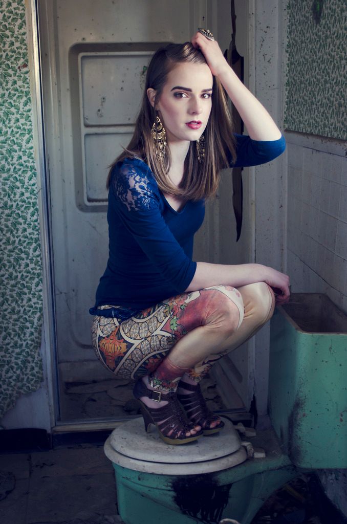
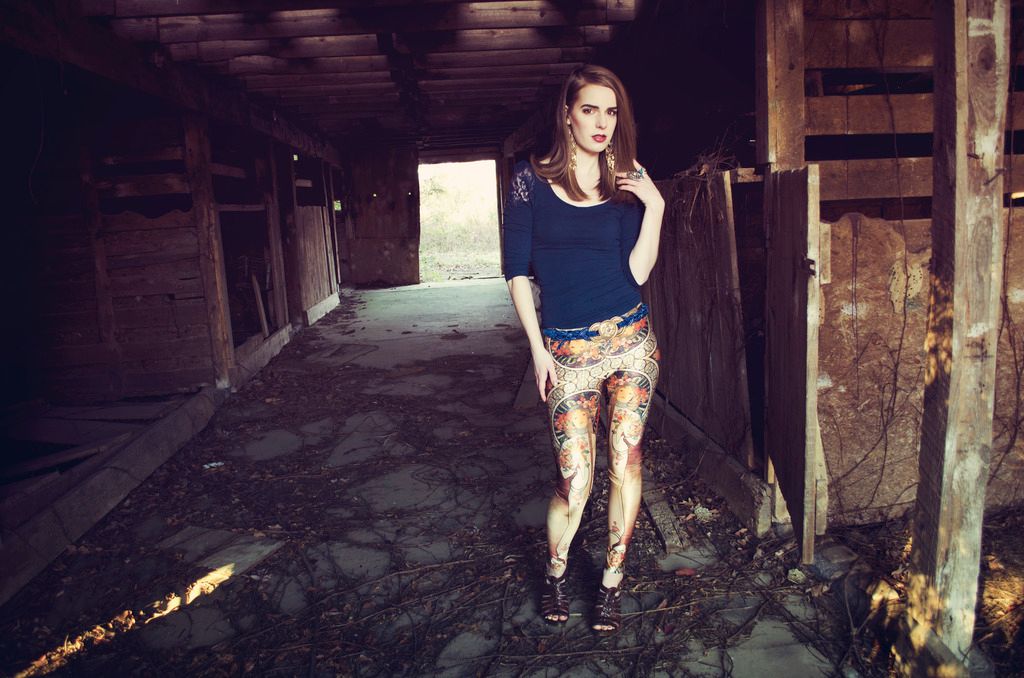
Keeping with the trend of solid-colored tops, I chose navy
blue for the palette of this look. This quarter-length shirt from H&M was a
great choice because I love the cut out lacey shoulders to add just the perfect
amount of flair. Adding something lacey complimented the femininity of the
figure on the leggings. Since I went with navy blue on top, I chose a dark blue
braided belt with a large gold medallion piece. This is actually a “family
vintage” item I own (it was my mom’s back in the 80’s and I’ve since
confiscated it.) Savvy readers might have noticed by now that the majority of
the looks (minus set number two) have contained belts of some sort. I feel that
belts are a great way to turn leggings into a pair of pants, or at least make
them feel like it. Since the belt is rather gaudy, this look said to me go
crazy with accessories. I like tons of accessories, but in my everyday,
on-the-go lifestyle, too many accessories would drive me insane. I think I may
do a series in the future just on how to style accessories.
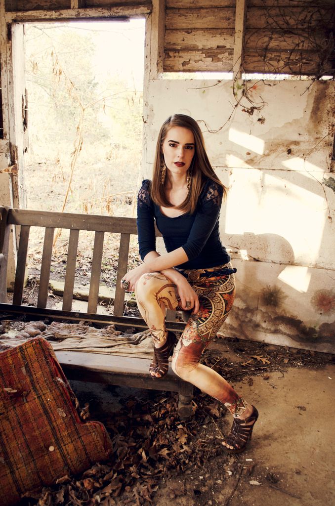
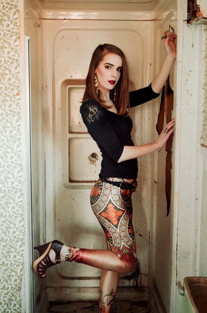
Do you remember that old abandoned house I shot at from three posts ago? These shots were taken in the bathroom of the home and in the barn nearby. Loved working with Nina on this second shoot!
Do you remember that old abandoned house I shot at from three posts ago? These shots were taken in the bathroom of the home and in the barn nearby. Loved working with Nina on this second shoot!
So let’s do a short recap on all we’ve learned about styling
bold printed leggings!
Solid color tops are perfectly ok to use, but you never want
to downplay the look with nothing but a solid color v-neck or t-shirt. Although
you do want to keep the top more on the plain side, some sort of embellishment
or elevated design will balance the boldness of the leggings with a top that’s
just tasteful enough. Also consider texture – a silky shirt or one that has a
sheen is ideal for being enough to stand on it’s own. If you do want to
incorporate other designs or patterns, go for something easy on the eyes, like
a muted stripe or repeated pattern. With leggings, you can easily opt for heels
or for flats, depending on where you’re going and needed level of comfort.
One topic I wanted to address about most of the looks,
namely the second and third set, was about how to capture the entire vibe of a
look while being aware of all pieces that you’ve coordinated for the outfit. With
the second look, I consciously embraced the art nouveau theme. I chose every
aspect of my style around what fit that art theme – I wore hairstyles that
worked with a braided gold headband so that both looks spoke to this light, airy
statuesque goddess woman archetype. I selected accessories that matched the
color palette of the pants. Essentially, I built each look around the color,
design, and texture of the pants. I love doing this with most outfits, it’s
easier to build from one foundation and work your way up. Even with this final
look, I really considered Mucha’s art when selecting my pieces. I wanted to use
items, accessories and styling choices that looked as though it came from the
same world of these leggings. This might come across as too over
the top for everyday wear, but because of this attention to detail, these looks (and photos) are among my
favorite that I’ve published. Capturing the vibe of a look is so much more than
just matching pieces together, it’s about executing an idea to it’s fullest.
You’re already wearing a bold, eye-catching design. Do you want an outfit or a
statement?
Thanks for joining me in this series! I'm planning on several more extended series in the near future, but for now, I'm returning to the individual posts on specific styling advice.
I think look one from part three is hands down my favorite of your series!! I love how you worked inspiration from different art periods, and it's certainly apparent in the photographic style and outfit looks!! <3
ReplyDeleteGreat post! Ive never feel brave enough to wear patterned leggings like this!
ReplyDeletewww.sabrinaharriet.com